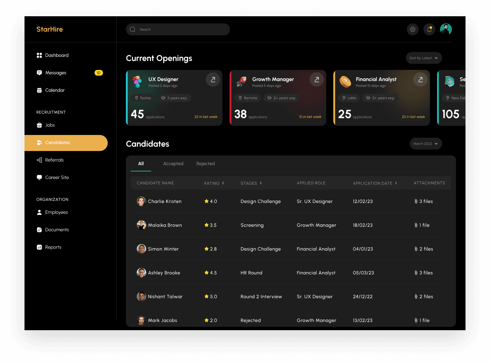
In every dashboard, there are a lot of items and options but organizing them in a useful way was the main objective.
The main options remain on the left side to easily switch to other options.
Filtering applications was the biggest issue so despite using a filter button that was not a good approach.
I just categorized them as accepted, rejected, and all.